

After studying dozens of breakout startups while researching my next book, I began noticing an interesting pattern.
Many of the companies achieving disproportionate visibility do not necessarily have the best products, the largest teams, or the biggest budgets. Instead, they appear to rely on a small set of branding mechanisms that increase the likelihood that someone remembers them and recognizes them again later.
Nowadays, nearly every company can generate polished copy, attractive visuals, and competent design systems. That’s table stakes.
The companies that seem to spread fastest increasingly design brands that feel distinctive, familiar, and culturally significant long before they have earned ubiquity through market share alone.
Below are five mechanisms I continue seeing across some of today’s fastest-growing technology companies.
1. Controlled Friction
Controlled friction is the intentional introduction of small visual inconsistencies that interrupt pattern recognition.
Over the past decade, software design has converged toward a fairly consistent aesthetic. Most interfaces rely on balanced grids, rounded corners, predictable spacing, modern sans-serif typography, and highly polished visual systems.
The problem is that as interfaces become more professionally designed, they also become more cognitively interchangeable.
The brain is exceptionally good at compressing familiar patterns. If something looks nearly identical to hundreds of other products, there is little reason to retain it.
Controlled friction introduces subtle deviations that force a second look.
Examples include:
Pixel typography
Brutalist layouts
Slight asymmetry
Imperfect spacing
Retro computing references
Unexpected negative space
Unusual typographic treatments
The result of the “Controlled Friction” strategy is a brand that feels as though its creators stumbled upon a gold mine the rest of the market has yet to discover. The subtle departures from convention signal independent thinking and create the impression that deeper insights may be embedded within the product itself.
Importantly, the objective is to introduce enough visual novelty that observers subconsciously infer the company may have uncovered a new planet of insight, taste, or opportunity that the rest of the market has yet to recognize.
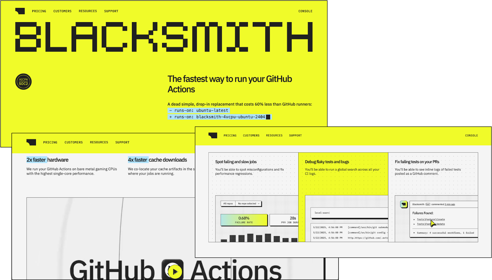
Controlled friction appears to have an optimal range. Too polished and the product becomes forgettable. Too chaotic and credibility deteriorates. The opportunity lies in introducing just enough visual tension to increase recall while preserving trust and usability.
Examples include Blacksmith, Are.na, and MSCHF.
2. Synthetic Motion
Synthetic motion is the use of static design elements that imply movement, activity, intelligence, or computational processing despite nothing actually moving.
Software screenshots are inherently inert. Without treatment, they often feel lifeless.
Synthetic motion attempts to solve this problem by making interfaces appear as though they are actively executing work.
Common techniques include:
Gradients that imply directional movement
Ambient glow effects
Bloom treatments
Blur diffusion
Glassmorphism
Particle systems
Dynamic lighting
The result of the “Synthetic Motion” strategy is a brand that feels ambient, ethereal, and slightly beyond reach, conveying cleanliness, sophistication, and a sense that something intelligent is happening just outside the viewer’s immediate understanding.
This is particularly common among AI companies because intelligence itself is difficult to visualize.
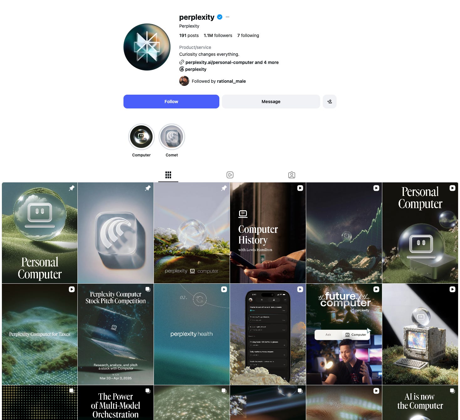
Glow, movement cues, and diffusion effects become proxies for abstract computation.
Examples include OpenAI, Runway, Granola, Suno, Midjourney, and ElevenLabs.
3. Product Isolation and Environmental Chaos
Product isolation is the practice of presenting highly legible product interfaces against soft, textured, or visually degraded environments to increase focus and imply system depth.
Many companies display screenshots against plain white backgrounds. Ubiquitous brands increasingly do the opposite. They place sharp, high-fidelity interfaces on top of blurred landscapes, darkened mountains, grainy textures, atmospheric photography, or pixelated backdrops.
The composition intentionally separates two visual layers.
The product layer is:
Crisp
Pixel-precise
Fully legible
Interactive in appearance
High-fidelity
The environment layer is:
Soft
Grainy
Blurred
Pixelated
Darkened
Photographic
Abstract
The contrast performs several functions simultaneously.
First, the eye immediately locks onto the interface because it is the most structurally organized and visually stable object within the composition.
Second, the environmental layer introduces depth, atmosphere, and contextual richness without competing for attention.
Third, placing products inside mountains, forests, landscapes, skies, or degraded photographic scenes can subtly suggest that the software exists within a larger operating environment rather than as an isolated tool.
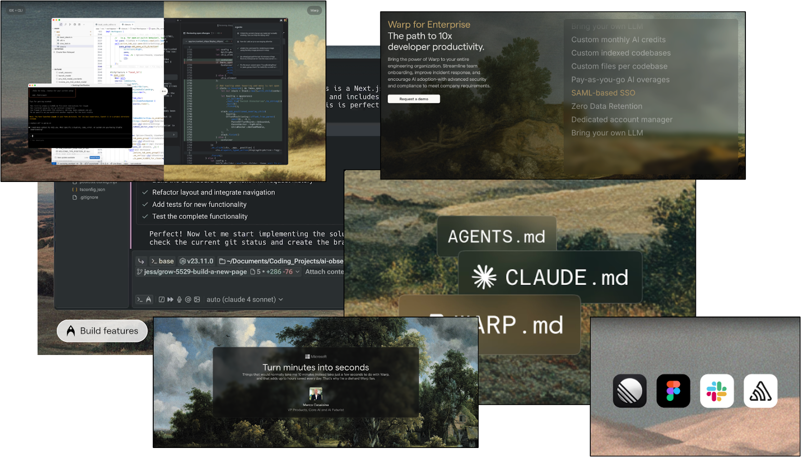
The environment provides context and depth, while the product remains the focal point.
The result of the Product Isolation and Environmental Chaos strategy is a brand that feels less manufactured and more discovered. By placing sharp interfaces within softened mountains, forests, skies, and textured landscapes, products begin to feel organic, ambient, and naturally embedded within the environments they inhabit.
Examples include Warp, Linear, Stripe
4. Abstract and Astronomical Environments
Abstract and cosmic visual systems detach products from their immediate category by removing familiar reference points and replacing them with imagery associated with space, astronomy, infinity, and the unknown.
Most software companies present products within recognizable contexts: dashboards, laptops, office settings, or users interacting with interfaces. These visual cues help viewers quickly understand what a product does, but they also make it easier to compare against competitors.
Some ubiquitous brands intentionally do the opposite.
They place products within undefined, astronomical environments characterized by:
Deep blacks
Purples, reds, and iridescent gradients
Ambient glow and halos
Nebulae and gaseous textures
Moons, planets, and celestial bodies
Starfields
Infinite horizons
Cosmic voids
Diffusion and depth effects
Abstract environments
By removing physical context, these companies also remove many of the cues people use to categorize products.
The product no longer appears as another tool competing within an established market. Instead, it can begin to feel larger in scope, more technologically advanced, and less constrained by the assumptions of an existing category.
Cosmic environments remove cues related to:
Place — the product is not tied to a specific office, desktop, or use case.
Time — the visual system feels less anchored to current design conventions.
Category — viewers are given fewer anchors for comparing the product against competitors.
For many products, particularly in AI, underlying capabilities are difficult to visualize directly. Astronomical environments provide an alternative visual language that borrows pre-existing associations humans already have with exploration, discovery, scale, and the future, communicating ambition and long-term positioning without relying on screenshots or feature explanations.
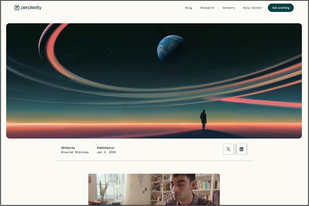
The result of the Abstract and Cosmic Environments strategy is a brand that feels temporally displaced. By borrowing the symbolic language of space—mystery, scale, exploration, advancement, possibility, and the future—it can appear more sophisticated, ambitious, and inevitable.
Examples include Perplexity, Nothing, Midjourney, SpaceX, Neuralink, and Interstellar Lab
5. Pre-Usage Simulation
Pre-usage simulation exposes prospective customers to realistic product experiences before they ever create an account.
Rather than asking visitors to imagine what using the product might feel like, companies provide enough interaction, context, or proof that users can predict the experience in advance.
Common implementations include:
Interactive demos
Embedded playgrounds
Workflow videos
ROI calculators
Templates
Customer recordings
Before-and-after examples
These assets reduce uncertainty.
Prospective customers can observe workflows, test capabilities, estimate outcomes, and understand how the product fits into their existing processes before committing time or money.
As a result, users often arrive at signup with an established mental model of the product, including an understanding of its interface, expected outputs, and potential value.
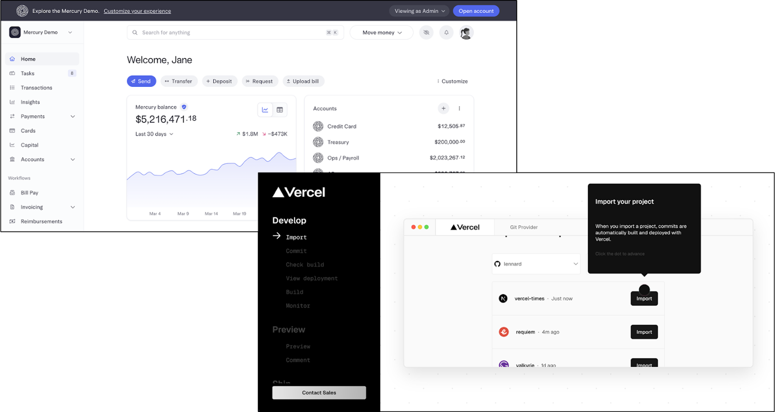
This can shorten evaluation periods, reduce friction during onboarding, and increase activation rates.
In these cases, branding extends beyond visual identity and begins functioning as a form of pre-onboarding.
The result of the Pre-Usage Simulation strategy is a prospective customer who feels substantially less uncertain because they already understand what the product does, how it works, and what value they are likely to receive before ever signing up.
Examples include Granola, Modal, Hex, MotherDuck, Tavily, and Mercury.
Branding as Perceptual Engineering & Influence
Most companies still treat branding as something that follows traction. The product works, the company grows, then the brand gets upgraded. But many breakout companies appear to invert that sequence.
They build brands that feel significant before the market has fully validated them. The brand itself creates a subconscious impression of ubiquity. It makes the company feel larger, more inevitable, and more culturally present than it may actually be.
That is the deeper function of these mechanisms. They are helping products imprint themselves into the psyche.
To become memorable, brands increasingly have to do something perceptually different. They have to create a feeling of familiarity before the audience has enough exposure to justify it.
That is why “ubiquity branding” is becoming a system of influence. It shapes what people notice, what they remember, what they trust, and what they assume is already happening around them.
As a note to end on, there is a darker science behind modern brand formation that would surprise most founders: symbolic logo design, engineered controversy, memetic distribution, scarcity theater, founder mythology, and more. Much of it exists to manufacture the feeling that a company is larger, more trusted, and more culturally relevant than its underlying metrics alone would suggest. If you’d like me to write that piece next, let me know.
I put together a one-page swipe file with 25 Google searches organized around the first four visual branding strategies explored in this essay (use them for mood boards, inspiration, and pressure-test your own visual identity) Grab it here.
One thing I'm becoming increasingly convinced of while writing Ubiquitous is that some startups do not WAIT to become ubiquitous. They design brands, products, and experiences that create the perception of ubiquity years before they've earned it through market share alone.
If you're interested in the broader framework behind how outlier startups go from 0 to $100M by becoming impossible to ignore, you can join the waitlist for my upcoming book here: https://michaelbecker.org/ubiquitousbook/